
This workflow creates a map in your browser using data copied from Excel; it does not create a chart inside Excel itself. Keep every row at the same geographic level, such as countries or US states. Test four rows before adding the full spreadsheet.
Open the US state map to follow the example below, or open the map maker and choose another supported area.
1. Copy place names and values
Put the area name in the first column and a number in the second. For this example every row is a US state: do not mix a state such as California with a city such as Los Angeles.
Place name	Value
California	82
Texas	64
Florida	47
New York	31
These are demonstration values, not official statistics. Copy the example or replace the numbers with your own. Copying cells from Excel preserves tab separators; CSV commas also work. Leave missing values empty rather than entering words such as “unknown”.
With only a few values, use Manual and fill the selected areas directly. For a file, use Upload file: XLSX, XLS, CSV and TXT are supported. See the CSV formatting guide for separators and encoding.
2. Choose the matching map area
The US map maker opens the states and the District of Columbia. Starting from the homepage, choose First-level Divisions and then United States. Keep the four example states selected; other states can remain as context with no data.
3. Paste and review the matches
Choose Paste table, paste both columns, then apply the data. Match review keeps the original text beside the matched map name. Confirm California, Texas, Florida and New York before styling. Editing a value updates the same map; clicking a mapped area brings its review row into view.
| Status | Meaning | What to do |
|---|---|---|
| Matched | One feature matches within the current scope | Check the value |
| Ambiguous | More than one place is possible | Use the complete place name |
| Unmatched | The place is outside the scope or spelled differently | Check level, scope, and name |
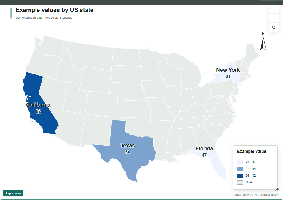
4. Set labels and the legend
Open Labels before fine-tuning colors. Show area names, add values if there is room, and give the legend a meaningful name and unit. The unit appears in the legend, not after every map value. You can also hide names without data and adjust the language, font and size. See the label and legend guide for dense maps.
5. Choose a map form and colors
Choose Area fill for a choropleth map. Comparable rates and percentages are usually better suited to this form than raw totals. Proportional bubbles or map bars can emphasize totals instead. The example numbers are only for testing: do not interpret them as a real regional pattern. The classification and color guide explains how to choose classes.
6. Export the map
Review the title, unit, labels and legend, then choose Export. PNG and JPEG work in slides; SVG keeps map elements editable in vector software. For output dimensions and fonts, follow the presentation export guide.
Common questions
Do I have to upload an Excel file?
No. You can type a few values directly or copy and paste two columns. XLSX, XLS, CSV and TXT files are optional and are parsed locally in your browser.
Can I map addresses or latitude and longitude?
This workflow matches supported area names or codes to existing boundaries. It does not geocode street addresses or plot arbitrary spreadsheet coordinates.
Are administrative codes required?
No. Supported place names are enough for most maps. Codes are useful when your source already uses a supported coding system.
Authoritative sources and further reading
- RFC 4180: Common Format and MIME Type for CSV FilesPublisher:RFC Editor
- Save an Excel workbook to text or CSVPublisher:Microsoft Support
Try four rows first
Confirm the scope and matches before adding the complete spreadsheet.
Open EasyMap →